ISSUES
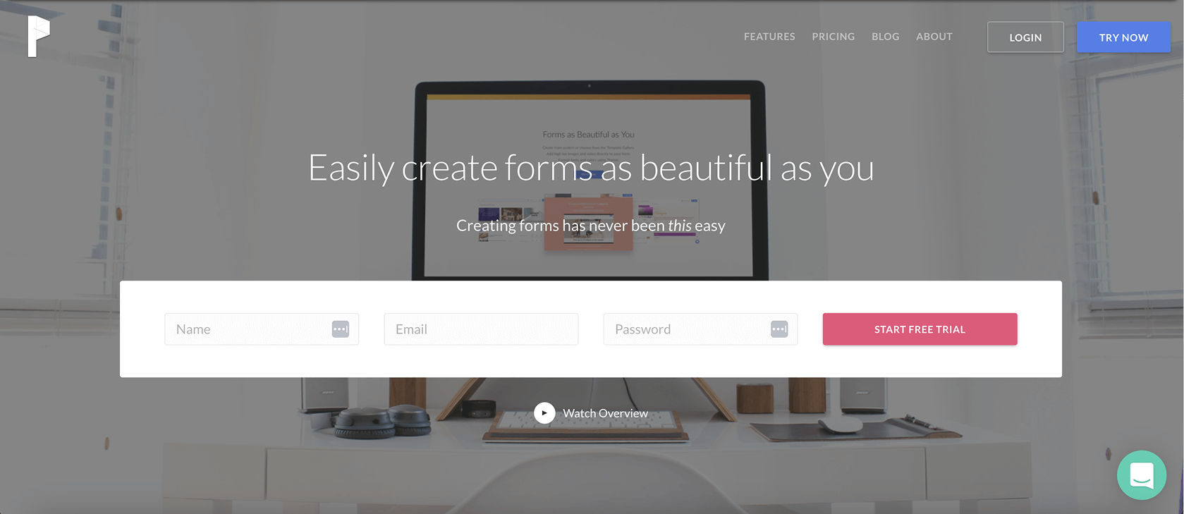
Paperform is a cutting-edge online form builder offering both aesthetics and functionality for businesses seeking automation. Competing against larger, well-funded market players, Paperform struggled to gain recognition and both uncover and address SMEs' specific needs when using form buildders. Succinctly articulating all of the platform's many capabilities and benefits in way that would get cut-through with busy business owners was core to Paperform's brand challenge. Paperform allowed for beautiful highly bespoke creations but the original branding struggled when reflecting that elegance in their own branding. Furthermore, external parties, such as review sites, often undersold the true value of the brand and the flexibility of the platform, leading to inconsistencies in communicating Paperform's unique selling proposition for SME business owners. Our challenge was to help Paperform not only showcase the powerful and innovative features it provided with ease but also articulate its comprehensive solution in a succinct and compelling manner.
INSIGHT
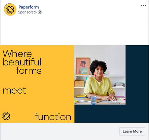
With the pandemic-driven remote work boom, CUT THRU discovered fresh avenues for growth for the Paperform brand. Researched uncovered the majority of users were found to be SMEs, rather than B2C customers, with a primary focus on working smarter, not harder. We uncovered these B2B users were typical of specific professional services industries and had unique requirements for tailored forms, automations, and other products. This insight inspired Paperform to concentrate on crafting specialized solutions, to better fill the market gap their competitors were neglecting. Users lauded the time-efficiency and the chance to focus on their core competencies, using Paperform to automate menial tasks with a high level of accuracy. Our branding strategy accentuated these benefits both visually and through their messaging, communicating they're the go-to brand for SME owners looking to reclaim their work/life balance.
ANSWERS
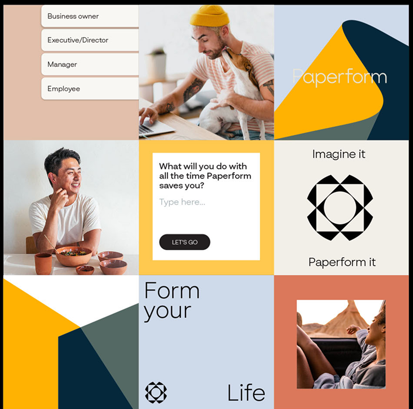
Emerging from our in-depth exploration was a kaleidoscope concept that revitalized Paperform's confusing name. Initially perplexing the market, as none of their forms were physical paper, we delved deep into the brand story to rekindle the name's essence. This process linked "paper" back to their original narrative, focusing on exceptional UX and making form-building as effortless and adaptable as putting pen to a blank sheet. Unlike its rigid competitors, Paperform's platform offers unmatched flexibility and is often referred to as a "digital Swiss Army Knife" for small and medium-sized businesses. Building on this metaphor, we explored similar concepts that convey beauty, flexibility, and structure. Inspired by visual metaphors from both kaleidoscopes and origami, we were able to visually communicate a sense of limitless possibility.
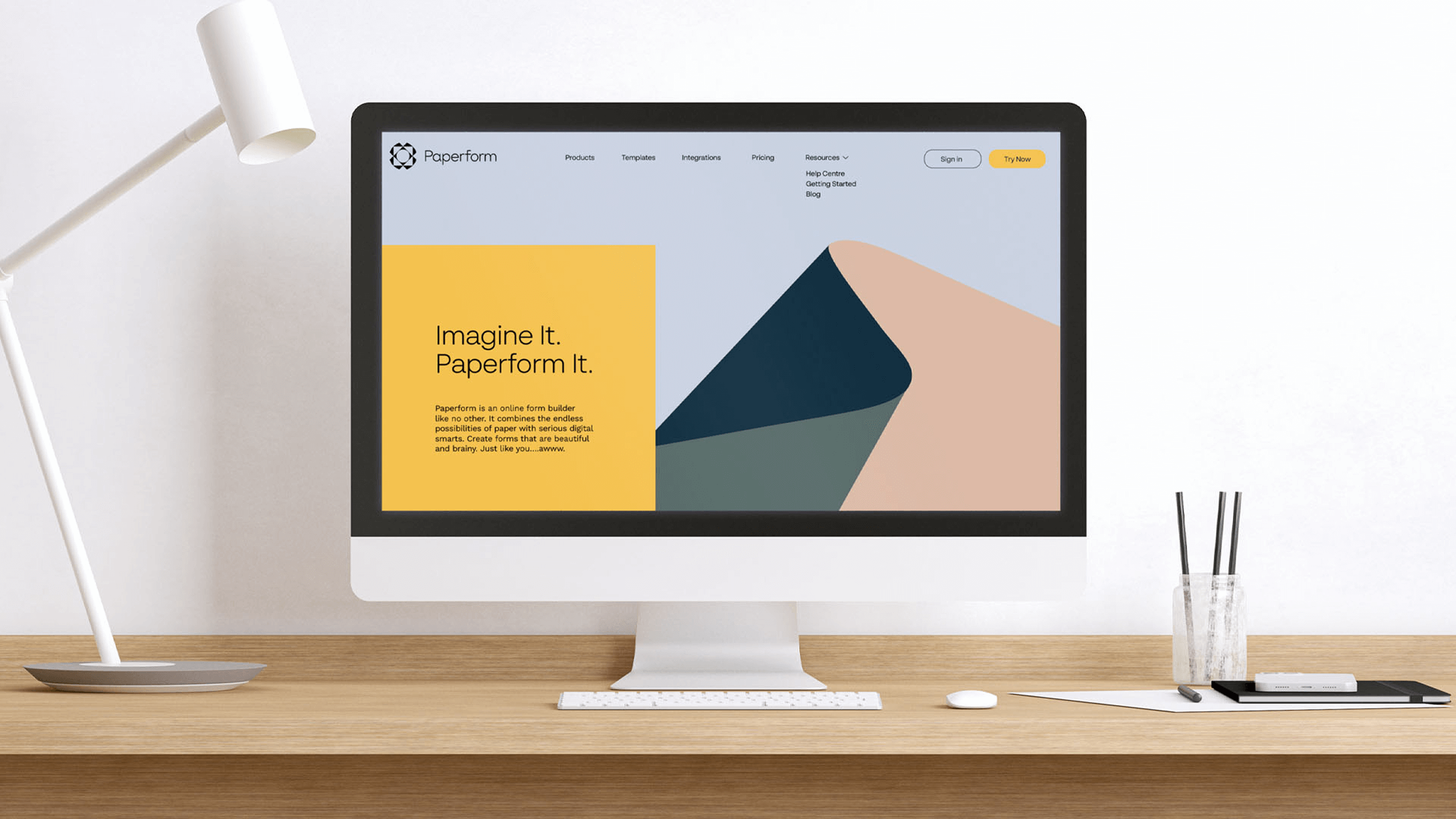
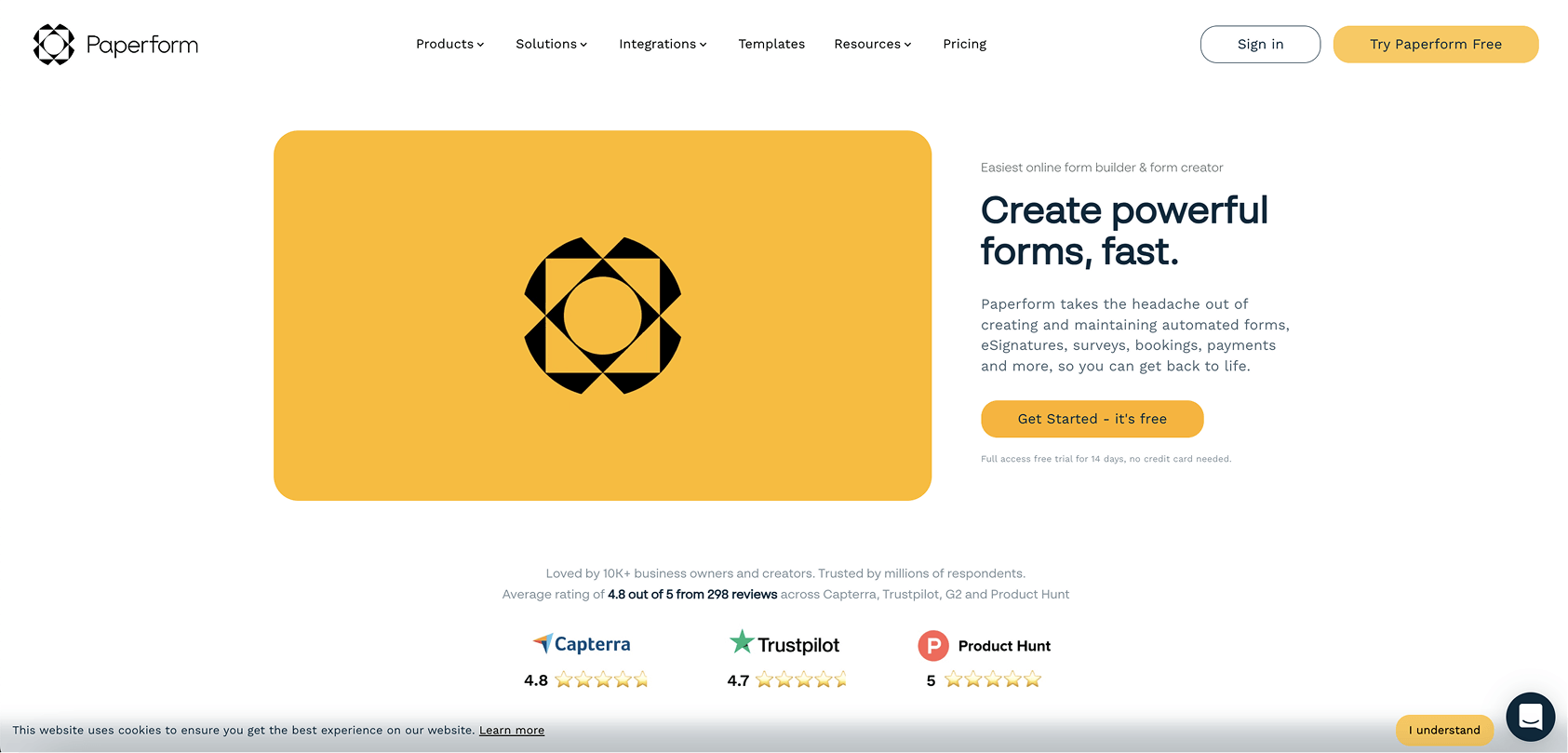
We've been inundated with positive feedback from our customer base, which was surprising as the visual changes were significant, and historically customers have been resistant to change. Our site metrics have also improved with greater retention on our blog, and increased number of conversions to our free trial. The website redesign has also garnered a lot of attention, and received a design award, thanks to CUT THRU's help.
CEO | Paperform