Creating a luxury brand in a sea of corporate sameness.
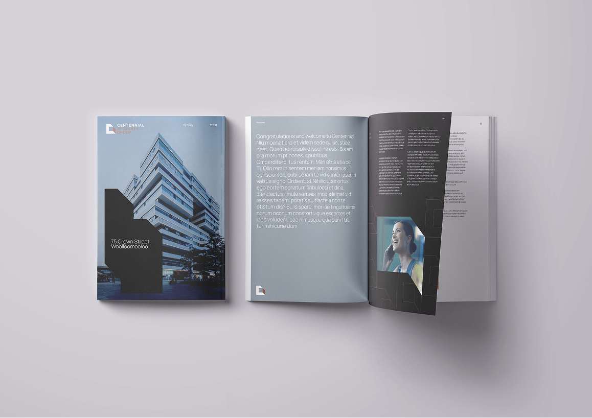
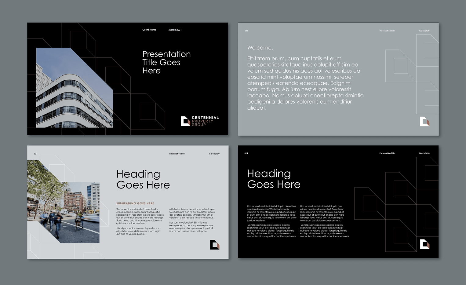
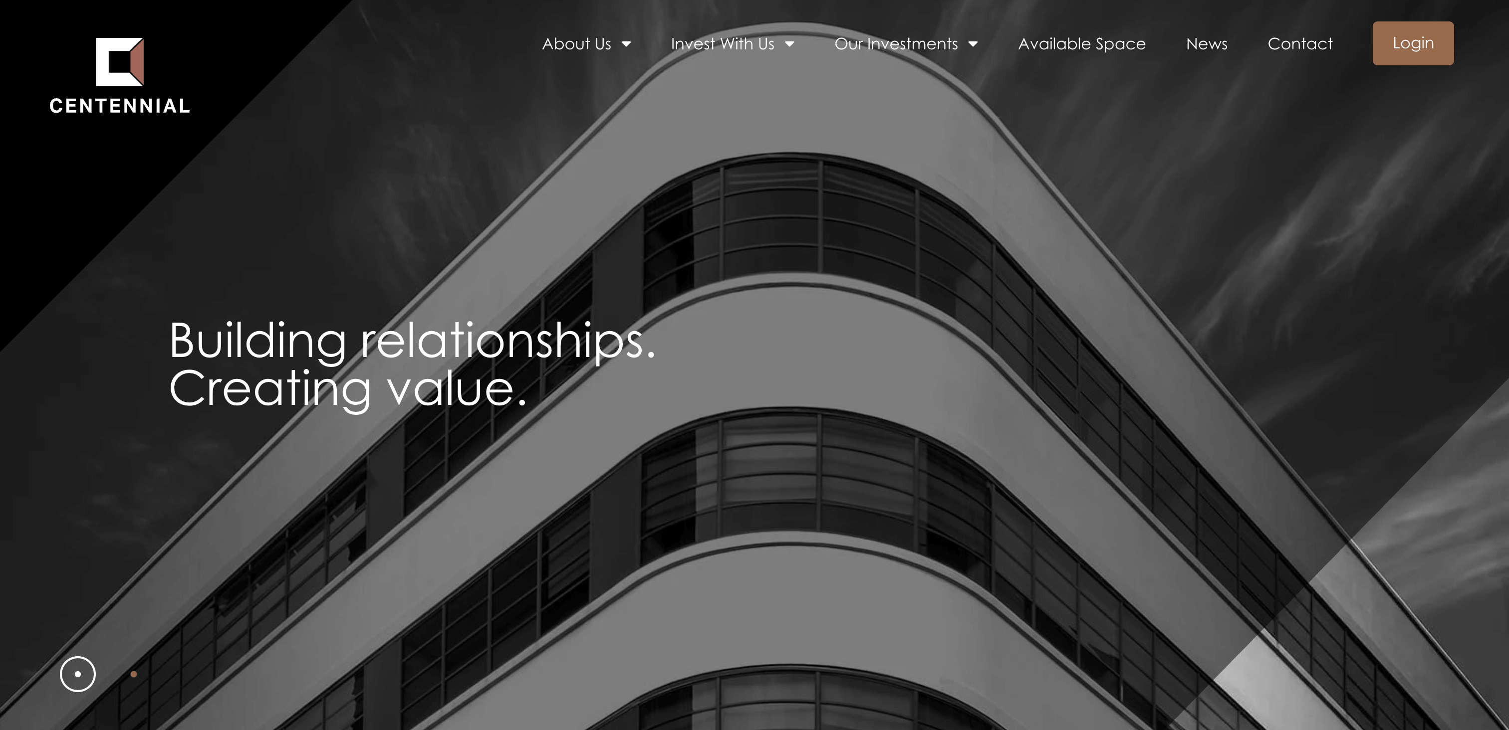
Centennial is a property investment group for high-end, sophisticated clients, but their brand was stuck in a “sea of boring sameness,” looking just like their competitors. Suffering from an inconsistent name and a lacklustre identity, they failed to communicate their unique value. Our mission was to create a distinctive, luxury brand that conveyed exclusivity and trust, positioning Centennial as a firm that sees elite opportunities others miss.
CHALLENGE
The challenge was to break Centennial out of the corporate mould that defines B2B property investment. Their brand was inconsistent—using multiple names—and visually indistinguishable from larger competitors. This made them feel like “just another player” to a sophisticated audience craving insider knowledge and exclusive opportunities. We needed to build a brand that felt valuable, trustworthy, and like a well-kept secret, clearly communicating their unique ability to see potential where others couldn’t.
APPROACH
Our approach was built on the core idea of “seeing things differently.” We developed a visual identity that used unusual architectural perspectives to communicate Centennial’s ability to find hidden opportunities. A luxe black, white, and copper color palette replaced the corporate blue, creating a sense of value and exclusivity. By simplifying the name to “Centennial” and reframing their communications around desire and luxury, we created a distinctive brand that now matches their elite ability to drive success for clients.