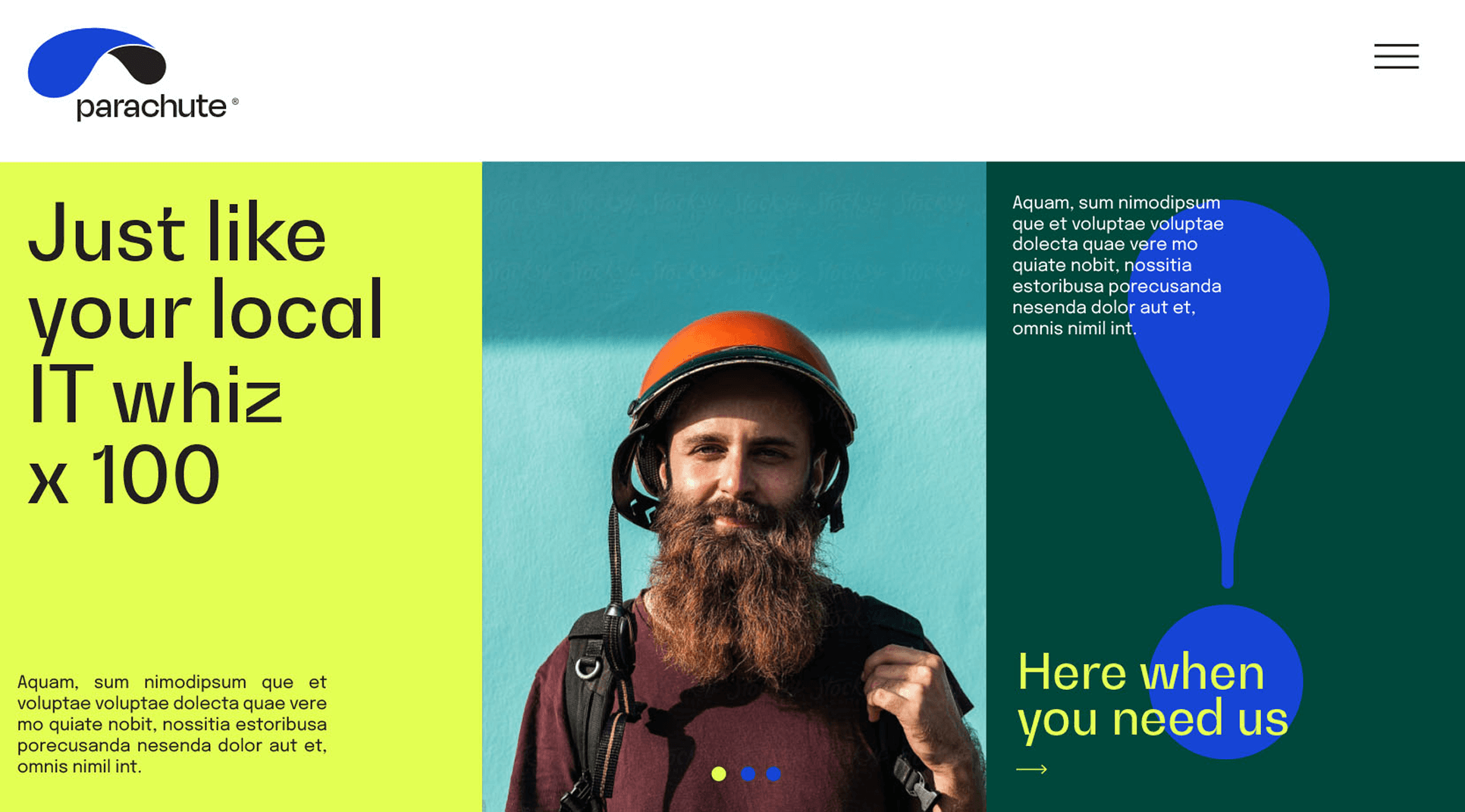
Giving a technically brilliant brand the personality it deserved.
Parachute is a trusted IT service provider in Silicon Valley with a solid technical reputation. However, their brand was bland, lacked personality, and didn’t reflect the forward-thinking, spirited nature of their team. The project was a strategic brand refresh, not a rebrand, designed to inject new energy and personality while carefully protecting a decade of hard-won brand equity and recognition in a competitive market.
CHALLENGE
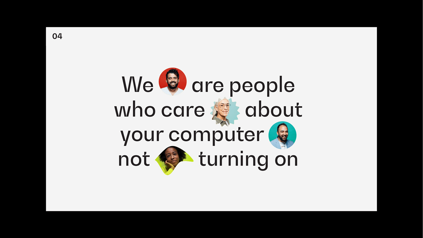
The challenge was to inject a vibrant personality into a trusted but technically-focused brand. Parachute’s identity conveyed their expertise but failed to capture the spirited, quirky nature of their team, which was a key differentiator. The primary task was a delicate balance: refresh the brand to feel modern and approachable for non-expert clients, while carefully protecting a decade of hard-won brand equity. We needed to evolve the brand, not erase it.
APPROACH
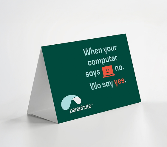
Our approach focused on giving the brand a human touch while protecting its core equity. We drew inspiration from the name “Parachute,” using the interior lines of a parachute as a visual motif to symbolize safety and robust systems. To make the brand more approachable for its non-expert audience, we infused the messaging with friendly, cultural IT jargon. This transformed the brand from a dry, technical service provider into a quirky, trusted, and cutting-edge IT partner.