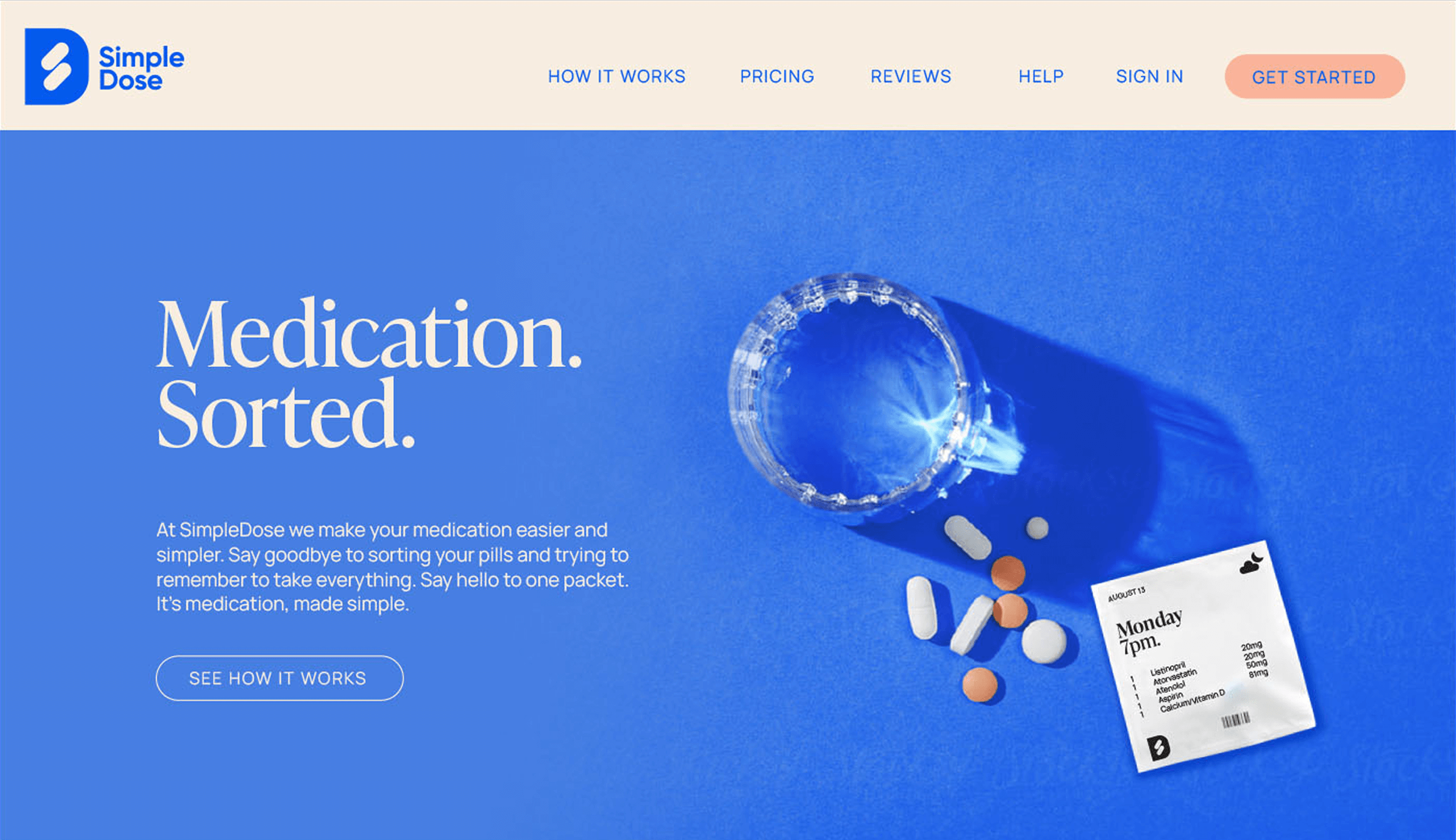
Transforming a confusing B2B brand into a symbol of safety and simplicity.
Medpack was a leader in healthcare packaging, but its brand was holding it back. The name had poor connotations and the overall identity was confusing, bland, and undifferentiated, failing to communicate the company’s true value. Our mission was to undertake a comprehensive rebranding effort, creating a new identity—Simple Dose—that clearly articulated its mission of making medication management easy, safe, and user-friendly for everyone.
CHALLENGE
The primary challenge was that Medpack’s innovative product was hidden behind a weak and uninspired brand. The name failed to communicate the core benefits of simplicity and superior safety, while the bland image allowed the company to be lost in a competitive healthcare market. We needed to shed this undifferentiated identity and create a new brand from scratch that could build trust, clearly articulate value, and truly reflect the quality of the product.
APPROACH
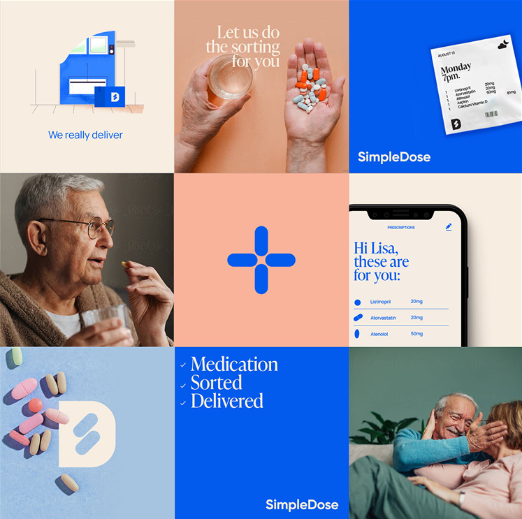
Our approach was grounded in customer insight. Research revealed that users deeply valued the product’s simplicity and its superior safety features compared to traditional alternatives. We built the entire brand strategy on these twin pillars: safety and convenience. This led directly to the creation of a new name, Simple Dose, which instantly communicates the core benefit. The new identity was designed to be a clear, trustworthy symbol of the company’s commitment to user-friendly medication management.